Materials & Textures That Make Architectural Renders Look Photorealistic
The gap between a photorealistic architectural render and an obviously CG one almost always comes down to material and texture craft, not software. Convincing renders rely on physically accurate surface data (PBR maps), adequate texture resolution, realistic imperfections, and correctly calibrated reflectivity — not just high polygon counts or expensive render engines. Get those four things right and the image reads as a photograph. Miss any one of them and trained eyes will spot the fakery immediately.
Why Do Some Renders Look Fake Despite High-End Software?
Software does not produce photorealism — material authorship does. A render built in a leading engine but using placeholder textures, uniform roughness values, and perfectly clean surfaces will look artificial regardless of render time or hardware.
The most common culprits we see when reviewing incoming briefs or fixing underperforming renders from other studios:
- Uniform, untextured surfaces. Real walls have micro-variation in paint sheen, mortar tone, and substrate bleed. A flat, single-color diffuse map reads as a test render.
- Incorrect IOR (index of refraction). Glass that refracts at the wrong angle, or water that looks like a flat blue plane, immediately signals CG.
- Missing normal and displacement maps. Geometry alone cannot capture the micro-relief of concrete, stone, or woven fabric. Without a normal map, surfaces look laminated.
- Over-clean materials. No fingerprints on glass, no joint staining on pavers, no weathering on timber — perfection is the tell. Real buildings are slightly imperfect from day one.
- Mismatched scale. A brick texture tiled at the wrong scale makes a wall look like a dollhouse or a warehouse, depending on the error direction.
For a broader look at visual red flags in finished renders, see our dedicated guide on why 3D renders look fake — this article goes deeper on the production-side causes.
Which Surface Materials Are Hardest to Render Convincingly?
Some material categories are disproportionately difficult to render well, and they happen to be the ones most commonly specified in premium residential and commercial projects.
Glass and glazing
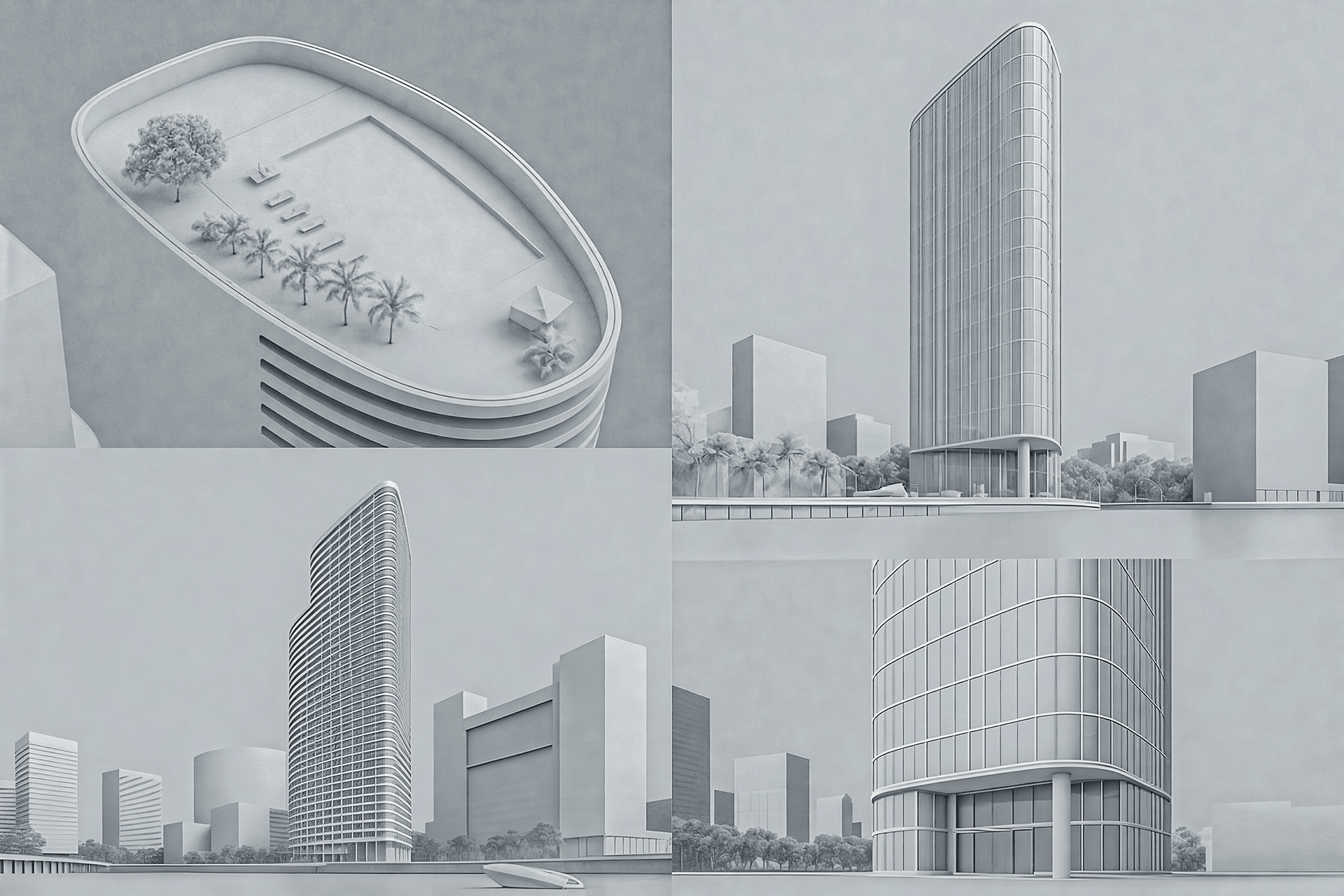
Architectural glass is the single hardest material to get right. It must simultaneously transmit, reflect, and refract — and those ratios change with viewing angle (Fresnel effect), interior lighting, and time of day. Tinted low-E glass has a slight green or blue cast visible only at oblique angles. Mullion reflections must align with the scene’s HDRI or light rig. In our exterior work, getting curtain-wall glazing to read as real often takes more iteration than any other element on the facade.
Polished and honed stone
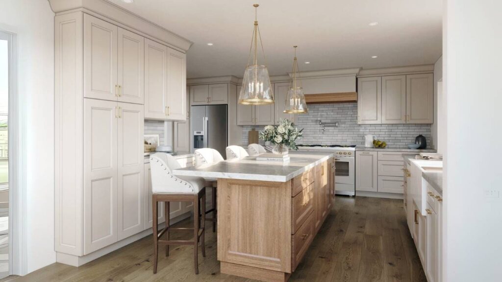
Marble, travertine, and quartzite have subsurface scattering — light penetrates a few millimeters before bouncing back. A standard diffuse-plus-reflection setup misses this entirely, producing a surface that looks painted rather than mineral. Correct SSS values, combined with a high-resolution albedo map showing genuine veining variation, are non-negotiable for luxury interior work.
Timber and wood cladding
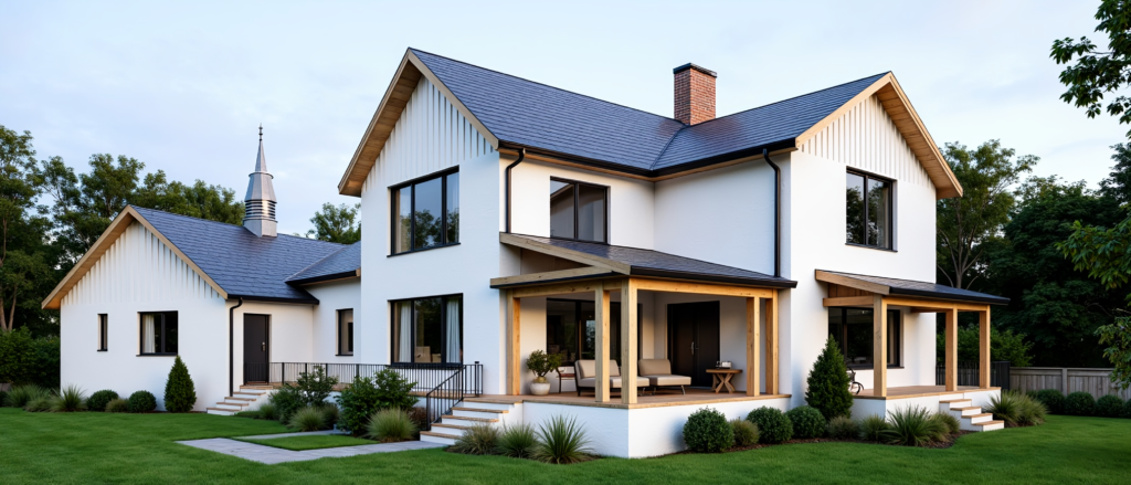
Wood grain must run in the correct direction and at the correct scale. Seamless tiling artifacts are immediately visible on long cladding runs. Aged or weathered timber needs a separate roughness variation map so that end-grain reads differently from face-grain — a detail that separates studio-grade work from template renders.
Water features and pools
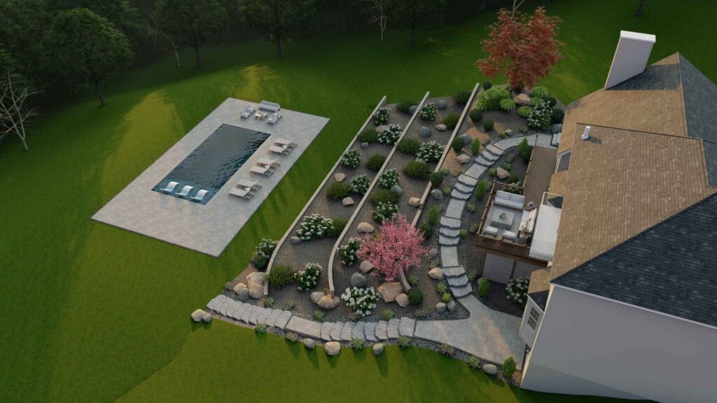
Still water needs a subtle normal-map ripple, correct caustic behavior, and accurate depth-color shift (shallow areas read lighter). Moving water — fountains, waterfalls — requires either simulation data or carefully authored displacement. Our landscape and pool rendering work treats water as its own lighting element, not an afterthought.
Fabric and soft furnishings
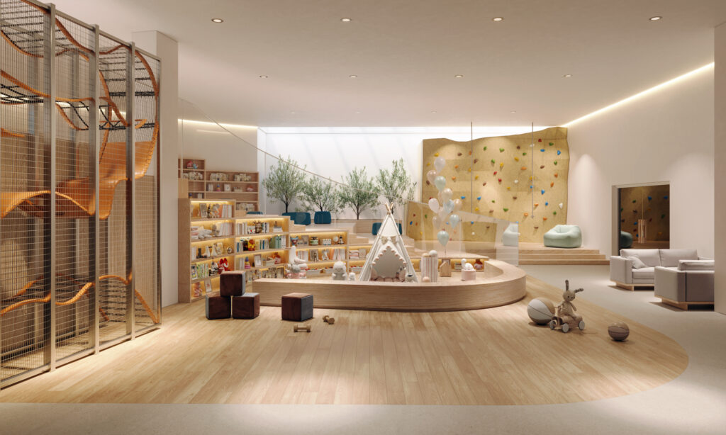
Interior renders live or die on upholstery. Fabric needs anisotropic sheen, correct fiber micro-structure, and gravity-driven wrinkle displacement. A sofa that looks vacuum-sealed in plastic destroys an otherwise strong interior composition.
How Does Texture Resolution and UV Mapping Affect Realism?
Texture resolution and UV unwrapping are the unsexy foundations everything else rests on. Even a perfectly photographed PBR material set will look wrong if the UV scale is off or the resolution is insufficient for the camera distance.
As a working principle: the closer the camera, the higher the required texel density. A facade shot from street level at 50mm equivalent needs 4K–8K albedo maps for stone or brick elements that occupy a large portion of the frame. The same facade in an aerial context can use 2K maps without visible degradation. Matching resolution to camera distance and subject area is a judgment call that comes from experience, not a formula.
UV mapping errors — visible seams, stretching at curved surfaces, misaligned grout lines at corners — are among the fastest ways to break photorealism. Cylindrical columns, curved walls, and organic landscape elements all require careful UV authoring or triplanar projection to avoid seams that no amount of post-processing can hide.
What Role Do Reflections, Roughness, and PBR Workflows Play?
Physically Based Rendering (PBR) is the industry standard workflow for a reason: it models how light actually interacts with surfaces using measured real-world data, so materials behave correctly under any lighting condition without manual tweaking per scene.
| PBR Map | What It Controls | Common Error When Missing or Wrong |
|---|---|---|
| Albedo (Base Color) | Raw surface color, no lighting baked in | Surfaces look over-lit or muddy; baked shadows create double-shadow artifacts |
| Roughness / Glossiness | Spread of specular highlight | Uniform roughness makes all surfaces look like the same material |
| Metalness | Conductor vs. dielectric behavior | Non-metallic surfaces that reflect colored highlights (physically impossible) |
| Normal Map | Surface micro-relief without geometry cost | Flat, laminated appearance on stone, fabric, concrete |
| Displacement Map | Actual geometry offset for macro-relief | Silhouettes of rough surfaces (gravel, bark) look perfectly smooth |
| Ambient Occlusion | Contact shadow in crevices | Elements appear to float; no grounding between surfaces |
| Opacity / Transmission | Glass, mesh, sheer fabric behavior | Glass reads as opaque or incorrectly refracts the scene behind it |
Roughness variation is particularly critical. A polished concrete floor is not uniformly 0.15 roughness across its entire surface — there are micro-scratches, aggregate variations, and sealer inconsistencies that produce subtle roughness noise. Baking that variation into the roughness map is what separates a convincing polished floor from one that looks like a mirror or a matte grey plane.
For context on how lighting interacts with these material choices, our guide on choosing render lighting — day, dusk, or night covers how the same material reads very differently across lighting conditions.
How Do Imperfections and Wear Make a Render Look Real?
Imperfections are the single most underused tool in architectural visualization. Real buildings — even brand-new ones — have subtle variation baked in by manufacturing tolerances, installation, and the first hours of exposure to the environment.
Effective imperfection techniques used in studio-grade renders:
- Edge wear maps: Metal and painted surfaces catch light differently at corners and edges. A subtle roughness increase at geometry edges (driven by a curvature map or edge-detect mask) adds immediate tactility.
- Grout and joint variation: Tile grout is never a uniform color. Slight tone variation, with darker values near wall-floor intersections, reads as authentic.
- Fingerprint and smear layers: On glass and polished metal, a very low-opacity smear normal map adds the micro-contamination that real surfaces always carry.
- Weathering gradients: Exterior renders benefit from subtle water-streak or oxidation gradients on concrete and metal, concentrated at horizontal ledges and overhangs where runoff accumulates.
- Fabric compression: Upholstery shows compression at seat edges and armrests. Gravity-driven wrinkle displacement on cushions and drapes signals physical plausibility.
The goal is not to make a building look old or damaged — it is to make it look real. A brand-new luxury residence still has micro-variation in its stone, slight sheen variation in its paint, and a glass facade that reflects a slightly imperfect sky. Adding that layer of controlled imperfection is what moves a render from “impressive CG” to “is that a photo?”
What Should Developers and Architects Brief to Get Better Material Results?
Better material briefs produce better renders. The most common source of material inaccuracy in a finished render is not the studio’s skill — it is insufficient reference at the briefing stage.
Provide these when briefing a render project:
- Manufacturer product codes or spec sheets for all key finishes (stone, tile, cladding, glass type). If the material has a specific sheen or finish grade (honed, polished, sandblasted), name it explicitly.
- Physical sample photography. A phone photo of a material sample held next to a white card in daylight gives the studio calibrated color and texture reference that no product website image can match.
- Scale reference. Confirm the module size of tiles, brick coursing dimensions, or plank widths. Without this, tiling scale is guesswork.
- Finish intent for adjacent materials. How a polished floor transitions to a matte wall affects both UV layout and roughness calibration at the junction.
- Precedent images. Even if the exact material is not shown, a reference image that captures the desired “feel” of a surface — the warmth of a particular timber, the depth of a specific stone — gives the studio directional guidance.
Our full guide on photorealistic rendering covers the end-to-end process, but material briefing is where the most value is gained or lost before production even starts.
How Do You Review Material Quality Before Final Delivery?
A structured material review at the draft stage prevents costly revisions at final delivery. Here is how to evaluate material quality in a render proof:
- Check scale first. Zoom to 100% crop on key surfaces. Brick, stone, and tile should read at the correct module size relative to doors and windows.
- Look at reflections. Reflective surfaces should show a plausible version of the scene around them — not a blurred grey blob or a perfect mirror. Check that glazing reflects the sky and surroundings at the correct angle.
- Evaluate surface variation. Uniform color across a large surface area is a red flag. Stone, concrete, and painted walls should show subtle tonal variation.
- Test the silhouettes of rough materials. Gravel, bark mulch, and rough masonry should have broken silhouettes at their edges, not smooth outlines.
- Check contact points. Where one material meets another — floor-to-baseboard, cladding-to-window frame — there should be contact shadow (ambient occlusion) grounding the junction.
- Compare against reference. Pull up the physical sample or manufacturer image alongside the render crop. If the render reads as a different material family, the albedo or roughness needs recalibration.
If you are evaluating renders for a development project and want to understand what a studio-grade material workflow looks like in practice, our exterior rendering service page outlines the production standards we apply across every project.
Frequently Asked Questions
What is PBR and why does it matter for architectural rendering?
PBR (Physically Based Rendering) is a material workflow that uses real-world measured surface data — albedo, roughness, metalness, and normal maps — so surfaces behave correctly under any lighting. It matters because PBR materials are lighting-agnostic: a concrete wall built with PBR maps will look right in daylight, dusk, and artificial light without manual re-tweaking for each scene.
How many texture maps does a photorealistic material need?
A complete PBR material set typically includes five to seven maps: albedo, roughness, metalness, normal, displacement, ambient occlusion, and sometimes opacity or transmission. Simpler materials like painted drywall may need only three. Complex materials like natural stone or fabric benefit from the full set, plus additional variation or mask maps for imperfections.
Does texture resolution always need to be 4K or higher?
Not always — resolution requirements scale with camera proximity and the proportion of the frame the surface occupies. An aerial or wide-angle exterior render can use 2K maps on most surfaces without visible loss. A close-up interior detail shot of stone countertops or tile may require 8K maps for the primary surface. Matching texel density to camera distance is a production judgment, not a fixed rule.
Why do water and glass look so obviously CG in some renders?
Both materials require accurate simulation of transmission, reflection, and refraction simultaneously — and both are physically impossible to fake with simple shader tricks. Glass needs correct Fresnel behavior and IOR. Water needs a normal-map ripple, caustic light behavior, and depth-driven color shift. When any of these are approximated or omitted, trained eyes immediately recognize the result as CG.
Can I request specific material finishes when briefing a render project?
Yes, and you should. Providing manufacturer product codes, finish grades (polished, honed, matte), physical sample photography, and module dimensions at the briefing stage is the single most effective way to improve material accuracy in the final render. The more specific the brief, the less interpretive latitude the studio needs — and the fewer revision rounds you will need.
Last updated: August 2026