Competition Renders: What Judges Actually Want to See
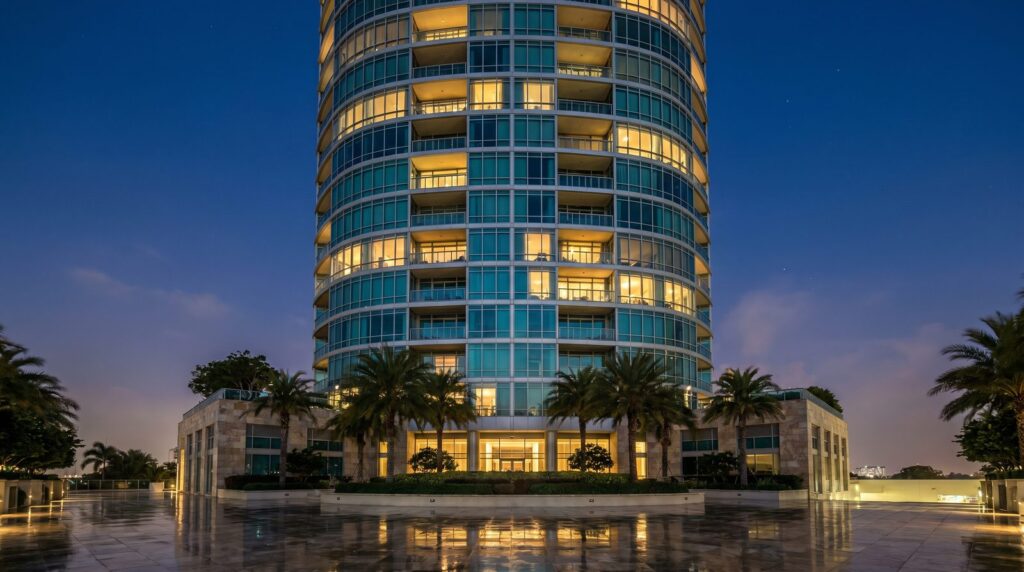
An effective competition render communicates design intent, site response, and spatial quality to a jury that is evaluating dozens of submissions simultaneously — not a developer or buyer who needs lifestyle reassurance. That shift in audience changes almost every decision: viewpoint, lighting mood, context density, colour palette, and how much the image “explains” versus “sells.” Get that distinction right from the brief, and the render earns its place on the shortlist.
How Are Competition Renders Different From Developer Marketing Renders?
Competition renders prioritise legibility of design over emotional aspiration. Where a developer marketing render is built to make a buyer feel something — golden-hour warmth, curated furniture, lifestyle figures — a competition render is built to make a jury understand something: how the building sits on its site, how it mediates scale with neighbours, how its materiality responds to the programme.
That does not mean competition images should be cold or diagrammatic. The best ones are still photorealistic and visually arresting. But every element in the frame — the entourage, the sky, the foreground — should serve the design argument, not distract from it. In our exterior work, we often strip back the lifestyle staging that would appear in a marketing render and replace it with contextual accuracy: real street furniture, accurate tree species for the climate zone, and a sky that matches the latitude of the site.
A few practical contrasts:
| Dimension | Marketing Render | Competition Render |
|---|---|---|
| Primary audience | Buyers, tenants, investors | Jury panel (architects, planners, critics) |
| Emotional register | Aspirational, warm, lifestyle-forward | Confident, clear, design-forward |
| Context treatment | Often softened or idealised | Accurate — shows real urban or landscape grain |
| Figures and entourage | Curated, diverse, active lifestyle | Minimal, scale-giving, non-distracting |
| Colour grade | Warm, saturated, golden hour | Neutral to cool, letting materials read accurately |
| View selection | Flattering angles, amenity-focused | Angles that reveal site response and massing logic |
| Interior shots | Staged, furniture-heavy | Spatial quality, structure, light quality |
What Viewpoints and Camera Angles Do Judges Respond To Most?
Judges respond to camera angles that reveal the design’s relationship to its site — not angles that simply make the building look tall or impressive. The most consistently effective viewpoints show the building arriving in its context: a street-level perspective from a realistic pedestrian approach, an oblique angle that reads both the primary façade and the side elevation, and — where the programme demands it — a view from within the public realm the building creates.
Avoid the “hero shot” camera that floats impossibly above eye level and centres the building symmetrically in frame. Juries have seen thousands of those. A camera set at true eye level (roughly 1.6–1.7 m), placed where a person would actually stand when approaching the building, reads as considered and site-specific.
For larger-scale or masterplan submissions, an aerial or bird’s-eye view is often essential — it communicates site coverage, landscape strategy, and urban grain in a single image. Our exterior rendering work on competition projects frequently pairs one ground-level view with one elevated oblique, giving the jury both the experiential and the strategic read.
Interior competition views should prioritise structural and spatial quality over furniture: the quality of light entering a space, the relationship between floor plate and section, the material palette at full scale.
Which Lighting Conditions Work Best for Competition Exterior Renders?
Overcast or soft-daylight conditions are the most reliable choice for competition exterior renders because they render materials accurately without the drama of a golden-hour grade obscuring surface readings. Concrete reads as concrete, glass reads as glass, and the jury can evaluate the palette as designed — not as filtered through an atmospheric effect.
That said, there are legitimate cases for dusk or twilight lighting in a competition context: civic or cultural buildings where the illumination strategy is part of the design argument, or where the brief explicitly asks for a night-activation view. In those cases, dusk lighting can powerfully communicate how the building performs as a public lantern. We treat dusk as a purposeful choice, not a default mood-booster.
Harsh midday sun tends to create deep shadows that obscure façade detail — rarely the right call unless the shadow-play itself is the design move being demonstrated. For most competition submissions, a soft overcast sky or a low-angle morning light gives the clearest, most credible read of the building’s materiality and massing.
See our detailed notes on exterior rendering specifications, materials, lighting, and camera angles for a deeper breakdown of how lighting conditions interact with different cladding types.
How Do You Show Context, Scale, and Site in a Competition Submission?
Context is where competition renders most often fall short. A building floating in a generic urban backdrop — stock-photo streetscapes, placeholder trees, invented neighbouring buildings — signals to a jury that the design has not genuinely engaged with its site. Accurate context is not just aesthetically better; it is a design argument.
For site-specific competitions, provide the studio with:
- Survey data or site plan showing neighbouring building heights and setbacks
- Street-view references for the actual approach sightlines
- Landscape character — species, density, seasonal condition
- Any heritage or protected structures that must appear in context
- Public realm elements: street furniture, paving, signage scale
Scale figures are one of the most effective tools in a competition render, and one of the most commonly mishandled. Figures should be placed where a real person would be — on the footpath, in the lobby threshold, at the base of a staircase — not scattered decoratively across the frame. Their scale relative to the building’s floor-to-floor heights is what the jury reads, consciously or not, to calibrate the design.
For masterplan or precinct-scale submissions, an aerial view that accurately models the surrounding urban fabric — even in a simplified massing form — communicates site response far more convincingly than a building rendered in isolation. Our architectural rendering for competitions and approvals work consistently shows that accurate context modelling is the single biggest differentiator between a shortlisted entry and a dismissed one.
What File Formats and Resolutions Do Architecture Competitions Require?
Requirements vary by competition, but a reliable baseline for most open architectural competitions is:
- Still images: TIFF or high-quality JPEG, minimum 300 DPI at the printed board size (commonly A1 or 24×36 in). For digital-only submissions, a minimum of 3000 px on the long edge is a safe floor; many competitions specify 4000–6000 px.
- Board layout: PDF, usually A1 landscape or portrait at 300 DPI. Confirm whether renders must be embedded at full resolution or whether a compressed PDF is acceptable.
- Colour profile: sRGB for screen-primary submissions; Adobe RGB or CMYK if physical printing is required. Always confirm with the competition organisers — colour profile mismatches cause visible shifts at print.
- Naming conventions: Many competitions require anonymised file names (no firm name or identifying text in the file or metadata). Brief your studio on this from the outset so renders are delivered clean.
Always download the competition brief’s technical specifications and share them with your rendering studio at the point of briefing, not the day before submission. Format problems discovered at the last hour are avoidable.
How Early Should You Brief a Studio Before a Submission Deadline?
For a standard competition package of three to five exterior and interior views, brief the studio a minimum of three weeks before the submission deadline — four to five weeks if the project is large-scale, context-heavy, or involves animation. That timeline allows for an initial concept pass, a round of camera and composition feedback, a lighting and materials revision, and a final delivery with buffer for format checks.
The single most common mistake in competition render briefs is treating the rendering studio as the last step in the workflow, when it should be a parallel one. As soon as the design is stable enough to extract a massing model — even a simplified one — the studio can begin blocking camera positions and context modelling. Refinements to the design can be incorporated progressively rather than in a single panicked handover.
For practices working to tight competition cycles, it is worth reading our notes on rendering for architects — specifically the section on model handover formats and what level of detail is needed at each stage.
What Does a Winning Competition Render Brief Look Like?
A strong competition render brief is specific about intent, not just deliverables. It tells the studio what argument the render needs to make, not just what building it needs to show. The best briefs we receive include:
- Design narrative: Two to three sentences on what the project is trying to achieve — the jury’s lens for evaluating it.
- View rationale: For each requested view, a note on what design move it should communicate (e.g. “this angle should show how the colonnade creates a sheltered public threshold”).
- Context accuracy requirements: What neighbouring buildings, landscape, or public realm elements must be modelled accurately versus which can be approximated.
- Lighting intent: Whether the lighting should read as neutral/analytical or atmospheric, and if atmospheric, why.
- Competition technical specs: File format, resolution, colour profile, board dimensions, anonymisation requirements — all from the official brief.
- Deadline and revision rounds: The submission date, and how many feedback rounds are realistic within that window.
- Model files: What format the architectural model is in (Revit, Rhino, SketchUp, ArchiCAD), the current level of detail, and which elements are still subject to change.
A brief that answers those questions takes thirty minutes to write and saves days of back-and-forth. It also produces a render that actually argues for the design — which is the only thing a competition render needs to do.
If you are preparing a competition submission and want to discuss the render package, our exterior rendering service page covers what we need from you and what the process looks like from brief to delivery. Or go straight to the contact page to start the conversation.
Frequently Asked Questions
Can I use the same renders for a competition submission and for client marketing?
Sometimes, but rarely without adjustment. Competition renders are optimised for jury legibility — accurate context, neutral lighting, analytical camera positions. Marketing renders prioritise emotional appeal. A dusk lifestyle render can work in a competition if the illumination strategy is the design argument, but using a marketing render as-is often reads as unfocused to a jury.
How many renders does a typical architecture competition submission need?
Most open competitions specify between two and six images. Three tends to be the practical sweet spot: one ground-level exterior view showing site arrival, one aerial or elevated view showing site response and massing, and one interior or threshold view showing spatial quality. Additional views should only be added if they communicate something the first three cannot.
Should competition renders include people and entourage?
Yes — but sparingly and purposefully. Figures give scale, which juries need to calibrate massing and floor-to-floor heights. Place them where real people would be: at building entrances, on footpaths, in public spaces. Avoid decorative scattering. Over-populated scenes shift the read from architectural to lifestyle, which is the wrong register for a competition jury.
What model format should I send to a rendering studio for a competition project?
Rhino and SketchUp are the most portable and widely accepted. Revit models work well if exported cleanly — confirm the studio’s preferred import format before sending. At competition stage, a clean massing model with key material zones indicated is more useful than a fully detailed model with unresolved geometry. Provide reference images for any materials that need to read accurately.
Is animation worth including in a competition submission?
Only if the competition explicitly allows or requests it, and only if the spatial sequence is central to the design argument — a promenade, a civic route, a landscape journey. A short, well-composed walkthrough can communicate spatial quality that stills cannot. But a poorly timed or generic flythrough adds nothing and takes significant production time that could go into stronger still images.
Last updated: August 2026