Interior Renders: How to Show Finishes That Close Sales
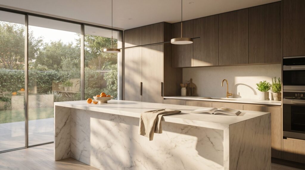
Interior 3D renders communicate finishes and materials to buyers before a unit is built by translating specification sheets — tile codes, cabinet door profiles, countertop slabs, flooring species — into photorealistic scenes where light interacts with surface texture, sheen, and color exactly as it would in a finished room. When done correctly, a buyer looking at a render can distinguish matte from satin cabinetry, see the veining pattern on a quartz countertop, and feel the warmth of wide-plank white oak underfoot. That level of material fidelity is what moves pre-sale contracts before a single wall goes up.
Why Finishes Are the Make-or-Break Detail in Pre-Sale Interiors
Floor plans tell buyers how a unit is laid out. Finishes tell them whether they want to live there. In pre-construction sales, the finish package is often the single largest variable between a buyer who signs and one who walks. A render that shows generic gray floors and placeholder cabinetry leaves that decision unmade — and hesitation rarely converts.
Developers who invest in accurate interior rendering with specified finishes report shorter sales cycles and fewer post-contract change-order disputes, because buyers have already seen — and agreed to — exactly what they’re getting. The render becomes a visual contract, not just a marketing asset.
The stakes are especially high in the mid-to-luxury segment, where buyers are comparing your unit against a competitor’s finished model suite down the street. A photorealistic render of your actual finish package levels that playing field before you’ve poured a slab.
Which Finish Types Render Best (and Which Need Extra Attention)
Not all materials behave the same way in a 3D environment. Some translate immediately from spec sheet to render; others require careful texture work and lighting calibration to read correctly.
| Finish Type | Renders Easily? | What Needs Extra Attention |
|---|---|---|
| Matte painted walls | Yes | Color accuracy under warm vs. cool light |
| Polished stone / quartz countertops | Yes | Veining pattern scale; reflectivity level |
| Hardwood / engineered wood flooring | Yes | Plank width, grain direction, sheen (matte vs. satin) |
| Large-format porcelain tile | Yes | Grout joint width; bookmatching on feature walls |
| Brushed metal hardware | Moderate | Anisotropic reflection; brushing direction |
| High-gloss lacquered cabinetry | Moderate | Reflection of adjacent surfaces; avoiding over-gloss |
| Textured fabrics / upholstery | Moderate | Weave scale; subsurface scatter on velvet |
| Fluted or reeded millwork | Needs care | Shadow depth; profile sharpness at render resolution |
| Backlit glass / translucent panels | Needs care | Light bleed calibration; avoiding plastic look |
| Natural stone with movement (book-matched marble) | Needs care | Custom texture maps required; not a stock material |
The bottom line: the more a material relies on micro-surface variation — stone veining, fabric weave, brushed-metal directionality — the more important it is to supply high-resolution reference images or manufacturer texture files to your rendering studio.
Flooring, Cabinetry, and Countertops: A Renderer’s Checklist
These three finish categories dominate the visual weight of any interior render. Getting them right is non-negotiable for a pre-sale asset that actually closes deals.
Flooring
- Specify plank or tile dimensions (e.g., 7.5″ × 75″ engineered oak, or 24″ × 48″ porcelain)
- Confirm installation pattern (straight run, herringbone, brick-offset, large-format continuous)
- Provide manufacturer name and SKU, or a high-res photo of the actual sample
- Note sheen level: matte, satin, or semi-gloss — this changes how light reads across the floor plane
- Indicate baseboards: painted MDF, stained wood, or shadowline reveal
Cabinetry
- Door style: flat slab, shaker, inset, or profiled — each casts different shadows
- Finish: painted (provide Benjamin Moore / Sherwin-Williams code), stained wood veneer, or high-gloss lacquer
- Hardware: pull dimensions, finish (brushed gold, matte black, polished nickel), and mounting position
- Upper cabinet treatment: open shelving, glass-front, or solid — affects depth and layering in the render
Countertops
- Material: quartz (brand + color), natural stone (slab photos preferred), sintered stone, or laminate
- Edge profile: eased, mitered, waterfall, or ogee
- Thickness: standard 3 cm or thin 1.2 cm stacked
- Backsplash relationship: full-height slab, tile, or painted — specify the transition detail
How to Provide Finish Specs to Your Studio for Accurate Results
The quality of an interior render is directly proportional to the quality of the brief you provide. Studios working from a vague “light wood floors, white cabinets” instruction will make assumptions — and assumptions create revision rounds that cost time and money.
The most efficient workflow looks like this:
- Send a finish schedule spreadsheet — room by room, surface by surface, with manufacturer codes where available.
- Attach physical sample photos — photograph samples against a neutral background in natural light. Avoid photographing under fluorescent office lighting, which skews color.
- Link to manufacturer product pages — many tile and flooring brands publish high-resolution texture files for exactly this purpose.
- Mark any hero finishes — if the book-matched marble island is your sales centerpiece, flag it. The studio will allocate more texture-mapping time to it.
- Provide the architectural drawings — ceiling heights, window locations, and door swings all affect how light enters and how finishes read.
If you’re unsure what to prepare, our project intake process walks you through a structured briefing template so nothing gets missed.
Lighting Choices That Make Finishes Pop in Interior Renders
Finishes don’t exist in isolation — they’re always seen under light. The lighting setup in a render is what separates a flat, catalog-style image from a scene that feels inhabited and desirable.
Key principles for finish-forward lighting:
- Natural light as the anchor: A window-lit scene with warm afternoon sun raking across a stone countertop communicates luxury more effectively than any overhead fixture alone.
- Layered artificial sources: Recessed downlights, under-cabinet strips, and pendant fixtures should all be modeled and illuminated — not just implied. Each adds a highlight that reveals a finish’s texture.
- Avoid flat, even lighting: Even illumination flattens texture. Shadow and highlight contrast is what makes a fluted panel look three-dimensional and a brushed-brass pull look tactile.
- Time of day matters: A kitchen render at midday reads differently than one at dusk with warm interior lighting. For pre-sale marketing, a late-afternoon or early-evening scene tends to feel aspirational without looking dark.
For more on how lighting strategy applies across project types, see our overview of real estate rendering services.
Staging vs. Empty Rooms: What Converts Better for Developers
The short answer: staged renders convert better, almost without exception. An empty room forces a buyer to mentally furnish the space — most can’t do it accurately, and the result is a room that feels smaller and colder than it is.
Virtual staging in a 3D render isn’t a cost add-on; it’s a conversion tool. Furniture placement communicates scale (a sofa next to a window tells you the ceiling is 10 feet), traffic flow, and lifestyle aspiration simultaneously.
Practical staging guidance for developers:
- Furnish to your buyer demographic — a young professional urban buyer wants different staging than a retirement-community purchaser.
- Don’t over-stage. Three to five hero furniture pieces and selective accessories read better than a room packed to catalog density.
- Use staging to reinforce finish choices — a warm-toned rug on a white oak floor, or a dark pendant over a light quartz island, draws the eye to the finishes you want buyers to notice.
- Consider two staging options for flex spaces — a room shown as both a home office and a guest bedroom gives buyers agency without requiring two full renders.
Common Finish Mistakes That Make Interior Renders Look Cheap
Even technically competent renders can undermine a premium finish package if these errors slip through. Review your renders against this list before approving for marketing use.
- Tiling a texture at the wrong scale: A floor tile that looks like 4″ mosaic when it should be 24″ × 48″ immediately signals a low-budget render.
- Using stock wood textures instead of specified species: Generic “wood” looks nothing like the actual white oak or walnut in your finish schedule.
- Over-reflecting polished surfaces: A countertop that mirrors the ceiling like a mirror reads as wet or plastic, not stone.
- Mismatched hardware finishes: Brushed nickel faucet, matte black pulls, and polished chrome hinges in the same render signals a lack of design intent — even if it’s a rendering error, not a design one.
- Flat painted walls with no subtle texture: Real painted walls have micro-texture from primer and roller application. A perfectly smooth CG wall looks digital.
- Ignoring grout joint color: Dark grout on light tile reads completely differently than white grout — and it’s a one-line spec that gets missed constantly.
Understanding what drives render quality — and cost — is easier when you know what you’re paying for. Our 3D rendering cost guide breaks down where budget goes and how to allocate it for maximum visual impact.
Frequently Asked Questions
How accurate can a 3D interior render be to the actual finished unit?
With a complete finish schedule, manufacturer texture references, and accurate architectural drawings, a photorealistic interior render can match the finished unit closely enough that buyers routinely mistake renders for photography. The limiting factor is almost always the quality of the brief — the more specific the specs provided, the more accurate the output.
Do I need to have all finishes finalized before starting interior renders?
Not necessarily. Many developers render a primary finish package first, then produce alternate colorway renders as finish options are confirmed. It’s more efficient to lock hero finishes — flooring, countertops, cabinetry — before starting, and add secondary decisions (hardware, backsplash, paint) in a revision round.
How long does it take to produce a finished interior render with accurate finishes?
A single interior scene with full finish specification typically takes five to ten business days from a complete brief, depending on scene complexity and revision scope. Providing a thorough finish schedule and reference images at project start is the single biggest factor in hitting that timeline.
Can renders show multiple finish packages for the same floor plan?
Yes — and this is a common and cost-effective approach for developers offering a standard and premium finish tier. After the base scene is built, swapping finish materials for an alternate colorway render costs significantly less than the original, because the geometry, lighting, and staging are already in place.
What file formats are delivered for marketing use?
Standard delivery includes high-resolution JPEG or PNG files suitable for print brochures, digital ads, and listing platforms. Raw layered files or print-ready TIFFs are available on request. For web and social use, optimized exports at specific pixel dimensions can be included in the delivery package.