Renders in Real Estate Brochures: What to Include
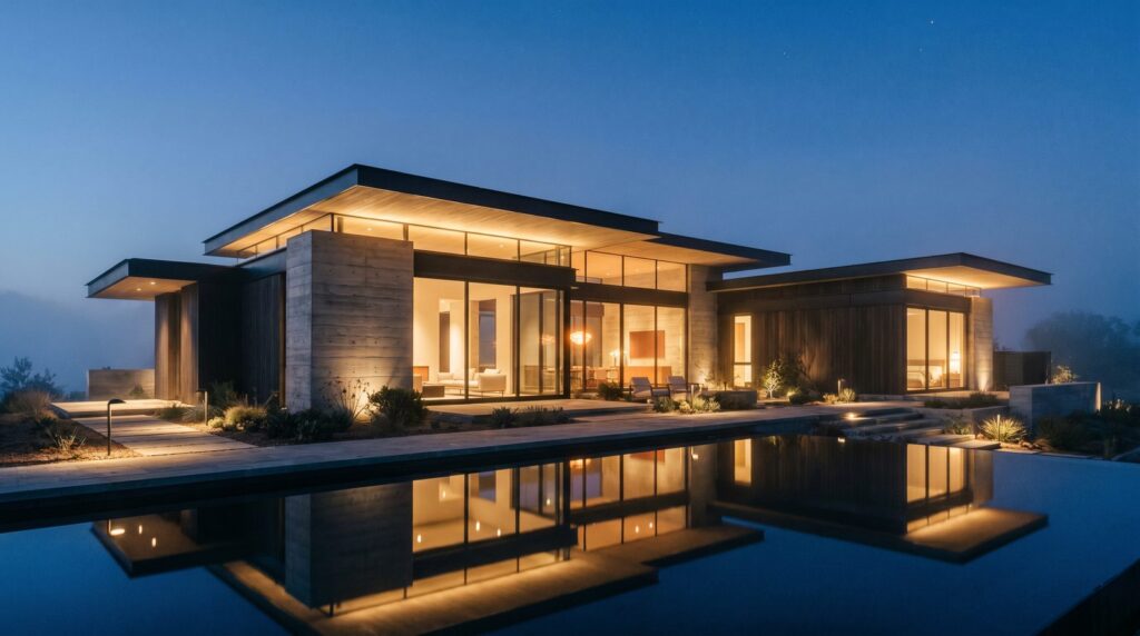
A real estate sales brochure needs four to eight renders sequenced in a specific order: an establishing exterior hero, one or two lifestyle exteriors, two to three key interior scenes, an amenity or outdoor-living shot, and a site or aerial context view. Each image should be delivered at 300 DPI for print and at least 2000 px on the long edge for digital. Captions should state room dimensions, finish specifications, and orientation — not just describe what the buyer can already see. That combination moves a prospect from first impression to deposit conversation.
Which Render Types Belong in a Sales Brochure?
A brochure is a closed, curated argument for buying. Every render must earn its page. The types that consistently do the work are:
- Primary exterior hero. A photorealistic day or dusk view of the main façade, with landscaping and context. This is the first full-bleed spread and the image that carries the brand. In our exterior work, dusk lighting — warm interior glow against a blue-sky gradient — consistently reads as more aspirational than a flat midday shot, and it prints with more contrast.
- Lifestyle exterior. A secondary angle that shows how residents actually use the building: an entry courtyard, a rooftop terrace, or a pool deck. This is where landscape and pool rendering earns its place in the brochure budget.
- Living or great-room interior. The single most-studied interior render in any brochure. Buyers use it to judge ceiling height, natural light, and finish quality. It must be staged to a specific unit type, not a generic floor plan.
- Kitchen interior. Countertop material, cabinet profile, appliance package — these are the details that justify the price point. A well-lit kitchen render closes more deals than almost any other single image.
- Primary bedroom. Especially for condo and multifamily projects, the bedroom render signals how the unit will feel to live in rather than just to visit.
- Amenity or outdoor-living scene. Pool, fitness center, co-working lounge — whichever amenity differentiates the project. One strong amenity render is usually enough for a brochure; the rest belong on the website or social.
- Aerial or site-context view. Shows proximity to water, city center, transit, or green space. A clean aerial or masterplan render answers the location question before the buyer has to ask it.
What does NOT belong: duplicate angles of the same façade, generic furniture-store interiors that don’t reflect the actual specification, and floor-plan diagrams that aren’t 3D — buyers skip flat 2D plans in a premium brochure.
How Many Images Does a Developer Brochure Actually Need?
For most projects, four to eight renders is the right range. Fewer than four and the brochure feels thin; more than eight and the narrative loses focus.
| Project Type | Recommended Render Count | Priority Scenes |
|---|---|---|
| Luxury single-family / custom home | 4–6 | Exterior hero, living room, kitchen, master suite, outdoor/pool |
| Boutique condo (under 30 units) | 5–7 | Exterior hero, lobby, living room, kitchen, amenity, aerial |
| Mid-rise multifamily / build-to-rent | 6–8 | Exterior hero, courtyard, living room, kitchen, bedroom, amenity, aerial |
| Mixed-use / commercial | 5–8 | Street-level exterior, lobby, key tenant space, rooftop or amenity, aerial masterplan |
These counts assume a brochure of 12–24 pages. If your designer is working with a 6-page digital flipbook, trim to four renders and make each one count. Volume is not a proxy for quality.
For a broader look at how renders function across the full marketing funnel — not just brochures — see our guide on how to use 3D renders in real estate marketing.
What Resolution and Format Do Print and Digital Brochures Require?
Print and digital have different technical requirements, and conflating them is the most common production mistake we see from marketing teams.
- Print (offset or digital press): 300 DPI at final print size, delivered as TIFF or high-quality JPEG (quality 10–12 in Photoshop terms). A full-bleed A4 spread at 300 DPI requires a render of roughly 2480 × 3508 px minimum; a US Letter spread needs approximately 2550 × 3300 px. For double-page spreads, double the width. Always add a 3–5 mm bleed on all edges.
- Digital PDF / interactive flipbook: 150–200 DPI at screen size is sufficient for on-screen reading, but we recommend delivering at 300 DPI anyway so the file remains print-ready. Long-edge pixel count of 3000–4000 px gives designers room to crop without losing sharpness. Export as sRGB; CMYK is for print only.
- Web / email preview: Compress to 72–96 DPI, JPEG at quality 7–8, for fast load. Never send a 300 DPI print file to a web designer and assume it will be optimised.
When briefing your studio, specify the final print size, bleed requirements, and whether the file will go to offset or digital press. These details affect how the render is composed — a full-bleed spread needs more sky or foreground than a boxed image — so they must be confirmed before rendering begins, not after. Our 3D rendering project brief checklist covers exactly what to include.
How to Sequence Renders So Buyers Move Through the Story
Sequence is the difference between a brochure that reads as a coherent sales argument and one that feels like a stock-image catalog. The proven structure follows the buyer’s natural journey of discovery.
- Cover: exterior hero. The first image the buyer sees must answer “What does this building look like?” with authority. Use the most photorealistic, best-lit exterior — typically a dusk or golden-hour shot. No text overlay should obscure more than 20% of the image.
- Context: aerial or site view. Place this early — page 2 or 3 — to answer “Where is this?” before the buyer has to wonder. A clean aerial render with labeled landmarks or transit nodes does the work of a paragraph of copy.
- Arrival: lobby or entry sequence. For multifamily and condo projects, the lobby render bridges the exterior and the unit interiors. It signals quality of finish and management intent.
- Living: key interior scenes. Living room, then kitchen, then bedroom — in that order. This mirrors how buyers tour a property in person. Each render should be a distinct unit type if the project has multiple configurations.
- Amenity: the differentiator. Pool deck, rooftop, fitness center — whatever the project’s headline amenity is. Place it after the unit interiors so it reads as a bonus, not a distraction from the core product.
- Close: lifestyle exterior or detail. End on an image that is aspirational rather than technical. A dusk pool scene, an outdoor dining terrace at golden hour, or a detail of the façade material. This is the image the buyer will remember.
This sequence works because it mirrors the emotional arc of a site visit: arrival, orientation, exploration, desire, confirmation. Disrupting it — for example, opening with an amenity before showing the building — creates cognitive friction that slows the buying decision.
What Captions and Specs Should Accompany Each Render?
Captions in a developer brochure are not decorative — they are a specification document in miniature. A buyer who is comparing three projects will read every caption carefully.
Each render caption should include:
- Scene identification: Unit type and level (e.g., “Type B2 — Level 12 Living Area”).
- Key finish specifications: Flooring material, countertop, cabinetry finish, and appliance brand where relevant. These are the details that justify the price point and reduce post-sales queries.
- Orientation and aspect: “North-facing” or “Eastern outlook over the bay” — buyers care about light and view, and this information is rarely included in the image itself.
- Disclaimer line: A short, legally required note that the render is an artist’s impression and finishes are subject to change. Your legal team will have a standard form; use it consistently on every render.
What captions should NOT do: describe what the buyer can already see (“A spacious living room with large windows”). That is wasted space. Use the caption to add information the image cannot convey.
For a full picture of how render quality and specification affect buyer confidence and project ROI, our real estate rendering ROI guide goes deeper on the business case.
How Brochure Renders Differ From Listing and Social-Media Renders
Brochure renders are a distinct production category — not the same files repurposed from your listing or social campaign.
| Attribute | Brochure Render | Listing Render | Social-Media Render |
|---|---|---|---|
| Resolution | 300 DPI / 3000+ px long edge | 72–150 DPI / 1500–2000 px | 72 DPI / 1080–1200 px |
| Aspect ratio | Matches page layout (A4, US Letter, spreads) | Portal-standard (typically 3:2 or 4:3) | 1:1, 4:5, 9:16 (platform-dependent) |
| Composition | Wide, with bleed; room for text overlays | Centered, full-frame subject | Tight crop, bold focal point |
| Color profile | CMYK for offset print; sRGB for digital PDF | sRGB | sRGB |
| Lighting preference | Dusk or golden-hour for hero; natural for interiors | Bright daylight (maximum clarity) | Dramatic / high-contrast (stops the scroll) |
| Staging density | Fully staged, lifestyle-complete | Lightly staged (space over lifestyle) | Hero prop only — minimal clutter |
The practical implication: brief your studio for brochure use from the start. Asking for a brochure-quality crop of a social render after the fact almost always means a re-render, because the original composition, resolution, and color profile were optimised for a different output. Specify the end use in your initial brief — our team always asks for this on day one of any real estate rendering project.
If you are weighing the cost of commissioning brochure-specific renders versus repurposing existing assets, the factors that drive that decision — complexity, view count, lighting passes, and print finishing — are covered in detail on our 3D rendering cost page.
Frequently Asked Questions
Can I use the same renders for both my brochure and my real estate listing portals?
Only if the renders were composed and exported at print resolution from the start. Listing portals need sRGB JPEGs at 72–150 DPI; brochures need 300 DPI files with bleed. If your studio delivered print-ready files, downsampling for web is straightforward. Upsampling a low-resolution listing render for print will produce a visibly soft result.
How early in the development timeline should brochure renders be commissioned?
Ideally six to twelve weeks before your first sales event or launch campaign. Brochure design, copywriting, legal review, and print production all run in parallel with rendering, so the renders need to be approved before the designer can complete layouts. Commissioning them after design starts creates costly delays at every stage.
Do I need a separate aerial render for the brochure, or will a site plan work?
A 3D aerial render outperforms a 2D site plan in a brochure because it communicates context — surrounding buildings, green space, water, street character — in a way a flat plan cannot. Buyers read aerials instinctively; they have to decode site plans. If budget is constrained, one aerial render and a simple labeled map is a stronger combination than a detailed 2D plan alone.
What is the right lighting for a brochure exterior hero render?
Dusk or late golden-hour lighting is the most effective for a brochure hero. It produces warm interior glow, deep sky contrast, and activated landscaping — all of which read well in both print and digital formats. Flat midday renders can look washed out in print, particularly on uncoated stock. Reserve bright daylight renders for secondary angles or site-context views.
Should brochure renders show furnished or unfurnished interiors?
Always furnished and fully staged for a brochure. Buyers need to see how a room functions and feels at the specification level your project offers. Unfurnished interiors communicate space but not lifestyle, and lifestyle is what justifies a premium price point. Staging should reflect the actual finish package for each unit type, not a generic aspirational look.
Last updated: September 2026