Competition Renders: What Judges Actually Want to See
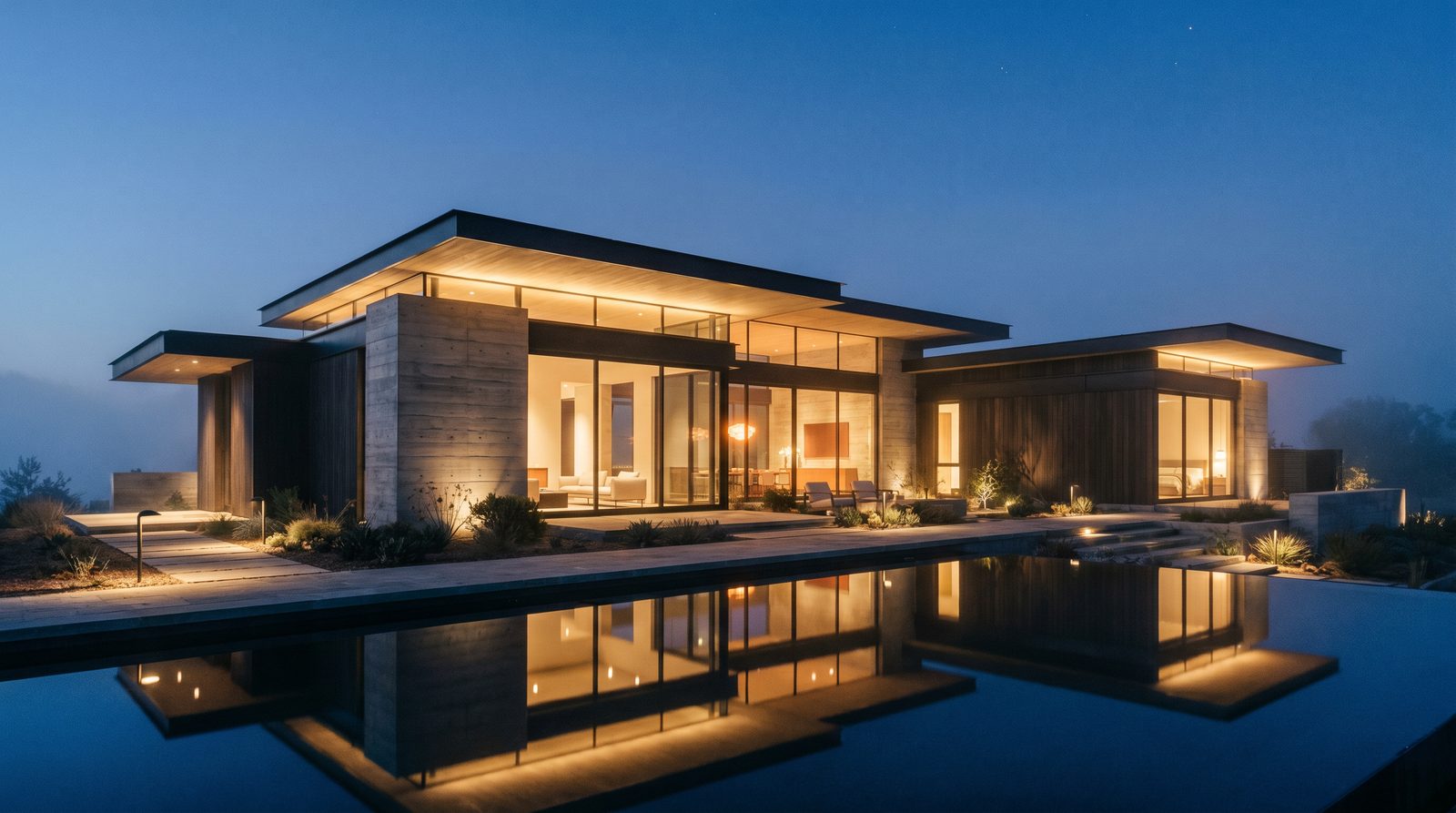
Competition renders succeed when they communicate design intent instantly, tell a coherent spatial story, and hold up under close scrutiny at full resolution. Judges are evaluating concept clarity, material honesty, human scale, contextual fit, and atmosphere — not photorealism for its own sake. Nail those five things and the technical quality will follow.
Why Most Competition Renders Fall Short
The most common failure is prioritising visual spectacle over legibility. A render can be technically flawless — sharp reflections, cinematic depth-of-field, dramatic lighting — and still leave a jury unable to read the building. Judges reviewing dozens of boards in a single session need to grasp your scheme in seconds. If the render forces them to work for it, you have already lost ground.
The second failure is inconsistency across a board. A stunning hero exterior paired with a flat, lifeless interior section signals that the scheme has not been fully resolved. Judges notice the gap and draw conclusions about the depth of the design thinking behind it.
What Judges Are Actually Evaluating
Jury panels — whether for design awards, developer RFPs, or public architecture competitions — are looking for the same core qualities, regardless of project type.
- Concept clarity: Does the render make the governing idea legible without a caption? The best competition images stand alone.
- Material honesty: Are the proposed materials shown accurately, not idealised? Judges with construction experience will flag finishes that look impossible to build or maintain.
- Human scale and activation: Entourage — people, vehicles, landscape — should feel native to the scene, not stock. Correctly scaled figures tell judges immediately how the space performs at street level.
- Contextual fit: The building must read as belonging to its site. Sky tone, surrounding vegetation, adjacent structures, and ground plane all need to be site-specific, not generic.
- Atmospheric storytelling: Lighting sets the emotional register of the project. The right time of day and weather condition can make a modest scheme feel resolved and ambitious.
Choosing the Right Views
View selection is a strategic decision, not an afterthought. The views you choose signal what you believe is strongest about the scheme — and what you want judges to remember.
The hero exterior view
A three-quarter perspective at pedestrian eye level remains the most legible single image for competition submissions. It shows the primary façade, the corner condition, the ground-plane relationship, and the sky in one frame. Avoid dead-on elevational views as hero images — they read as drawings, not proposals.
The interior or experiential view
Competition boards that include at least one interior or threshold view score better because they demonstrate that the design has been resolved beyond the envelope. A lobby, a key amenity space, or a view from inside looking out all tell judges that the scheme has depth. Our interior rendering work consistently shows that the interior view is where emotional connection is made — it is the image people remember.
The aerial or site view
For urban design competitions, masterplans, and mixed-use schemes, an aerial perspective showing the building in its site context is often decisive. It answers the question judges are always asking: does this belong here? See how an exterior rendering paired with an aerial read together to tell the full site story.
The detail or material close-up
A tight crop showing a façade detail, a material transition, or a threshold moment communicates design resolution at a level that wide shots cannot. It signals that the team has thought through the building at every scale.
Lighting: The Single Biggest Lever
Lighting is the most powerful tool in a competition render and the most commonly misused. The choice of time of day, sun angle, sky condition, and artificial light sources determines the mood, the material read, and the legibility of the form.
For most exterior competition renders, a late-afternoon golden-hour or early-dusk condition works best. It gives warmth to the façade, creates legible shadow lines that reveal form, and allows interior lighting to begin contributing — which makes the building feel inhabited rather than vacant. A flat midday sun is the safe choice and almost always the wrong one: it flattens form and kills atmosphere.
Dusk renders — where exterior ambient light and interior artificial light are in balance — are particularly effective for hospitality, residential, and retail schemes. In our exterior work, dusk lighting consistently produces the images that travel furthest on competition boards and in press coverage.
Overcast or diffuse-sky conditions are appropriate for schemes where material texture and colour accuracy matter more than drama — some institutional and civic competitions call for this register. Match the lighting mood to the emotional tone the scheme is trying to achieve.
Entourage and People: Show the Life, Not the Crowd
Entourage is where many competition renders betray their budget or their haste. Stock figures at the wrong scale, generic cars from the wrong decade, and copy-pasted tree species that do not grow in the project's climate all erode credibility with experienced jurors.
The rule of thumb we apply in the studio: entourage should feel inevitable, not inserted. People should be doing something plausible — walking with purpose, sitting, conversing — not posed awkwardly in the foreground. Landscape elements should be species-appropriate and seasonally consistent with the sky condition. Vehicles, where included, should reflect the project's market and location.
For projects targeting a specific demographic — senior living, hospitality, affordable housing — the people in the render should reflect that demographic. Judges notice when the figures bear no relationship to the intended occupants.
Board Layout and Image Hierarchy
Even a technically excellent render can underperform on a poorly composed board. Competition submissions are read at distance first, then up close. The hierarchy of images should guide the eye: hero image large and dominant, supporting views at a consistent secondary scale, detail crops as accents.
Avoid the common mistake of giving every image equal weight. A board of nine equally sized renders reads as nine competing arguments. One strong hero with three to four supporting images reads as one coherent proposal.
Consider how the renders will be reproduced. Competition boards are often printed large and also displayed on screens — sometimes simultaneously. Renders need to hold up at both scales. This means delivering files at sufficient resolution for large-format print and avoiding heavy post-production grain or blur effects that degrade at high resolution.
Common Competition Render Mistakes (and How to Avoid Them)
| Mistake | Why It Hurts | What to Do Instead |
|---|---|---|
| Flat midday lighting | Kills shadow depth and atmosphere; form reads poorly | Use golden hour or early dusk for exterior hero shots |
| No interior view on the board | Signals the scheme is unresolved beyond the façade | Include at least one interior or threshold perspective |
| Generic entourage | Erodes contextual credibility with experienced jurors | Use site-appropriate people, vegetation, and vehicles |
| Idealised materials | Experienced judges flag finishes that look unbuilable | Match material textures to real-world performance |
| Equal image hierarchy on board | No clear focal point; board reads as undecided | One dominant hero; supporting images at secondary scale |
| Missing site context | Building looks unanchored; contextual fit is undemonstrable | Include adjacent structures, topography, and sky specific to the site |
| Over-processed post-production | Heavy grain and blur degrade at print scale | Keep post-processing clean; deliver at full print resolution |
How Competition Renders Differ from Marketing Renders
Competition renders and real-estate marketing renders share the same technical pipeline but serve different audiences and carry different expectations. Marketing renders are optimised for emotional appeal and aspirational lifestyle — they are designed to sell. Competition renders are optimised for design legibility and professional credibility — they are designed to persuade experts.
This distinction affects every decision: lighting, entourage density, material specificity, and the level of contextual accuracy. A marketing render for a luxury condo might use a sunset sky and a rooftop party scene. The same building in a competition submission needs a more measured register — the design idea must be readable, not overwhelmed by atmosphere.
That said, the best competition renders do both: they are legible to a professional jury and emotionally compelling to a lay committee member or public audience. Striking that balance is the craft.
Briefing Your Renderer for a Competition
The quality of a competition render is directly proportional to the quality of the brief. The more resolved your design, the more the renderer can focus on storytelling rather than guesswork. At minimum, provide: confirmed geometry (even a massing model is better than nothing), a material schedule with real product references, site photographs or survey data, and a clear brief on the competition's tone and audience.
If you are working from early-stage concept geometry, be explicit about what is confirmed and what is indicative. A good studio will flag inconsistencies and ask the right questions rather than invent answers. For a deeper look at what to prepare, our guide on briefing renders for custom home builders covers the asset checklist in detail — the same principles apply to competition work.
Timeline matters too. Competition renders done under extreme time pressure almost always show it. Build render production into the competition programme from the start, not as a last-week deliverable. The best results come from at least one round of view and lighting review before final production begins.
Frequently Asked Questions
How many renders does a competition submission typically need?
Most competition boards are strongest with three to five renders: one hero exterior, one interior or experiential view, one aerial or site context view, and one or two detail or supporting images. More images rarely improve a board — they dilute the hierarchy and can signal that the team lacks confidence in any single image.
Should competition renders look photorealistic or diagrammatic?
It depends on the competition brief and the design concept. Most contemporary competitions expect photorealistic or near-photorealistic renders for exterior and interior views. Diagrammatic or illustrative styles work well for concept boards and masterplan overviews, but should be used deliberately — not as a substitute for resolved design intent.
What lighting condition works best for competition exterior renders?
Late-afternoon golden hour or early dusk is the most effective condition for the majority of exterior competition renders. It creates legible shadow lines that reveal form, adds warmth and atmosphere, and allows interior lighting to contribute — making the building feel inhabited. Flat midday light is almost always the wrong choice for a hero image.
How do competition renders differ from renders used for developer pre-sales?
Pre-sales renders are optimised to drive emotional purchase decisions — lifestyle-forward, aspirational, often with high entourage density and dramatic lighting. Competition renders prioritise design legibility and professional credibility. The audience is expert jurors, not buyers, so material accuracy, contextual fit, and concept clarity take precedence over lifestyle staging.
Can I use the same renders for the competition and for marketing afterward?
Sometimes, but plan for it from the start. Competition renders tend to be more measured and design-focused; marketing renders are often more lifestyle-driven. If you want dual-purpose images, brief the renderer on both use cases upfront so the lighting, entourage, and framing serve both audiences. Trying to repurpose competition renders for marketing after the fact often produces results that feel off-register for sales audiences.
Talk to Ratio Visuals about your competition brief — we work with architects and design teams across the US on competition submissions, from early-concept massing renders to full photorealistic board packages.
Last updated: November 2026