Materials & Textures That Make Architectural Renders Look Photorealistic
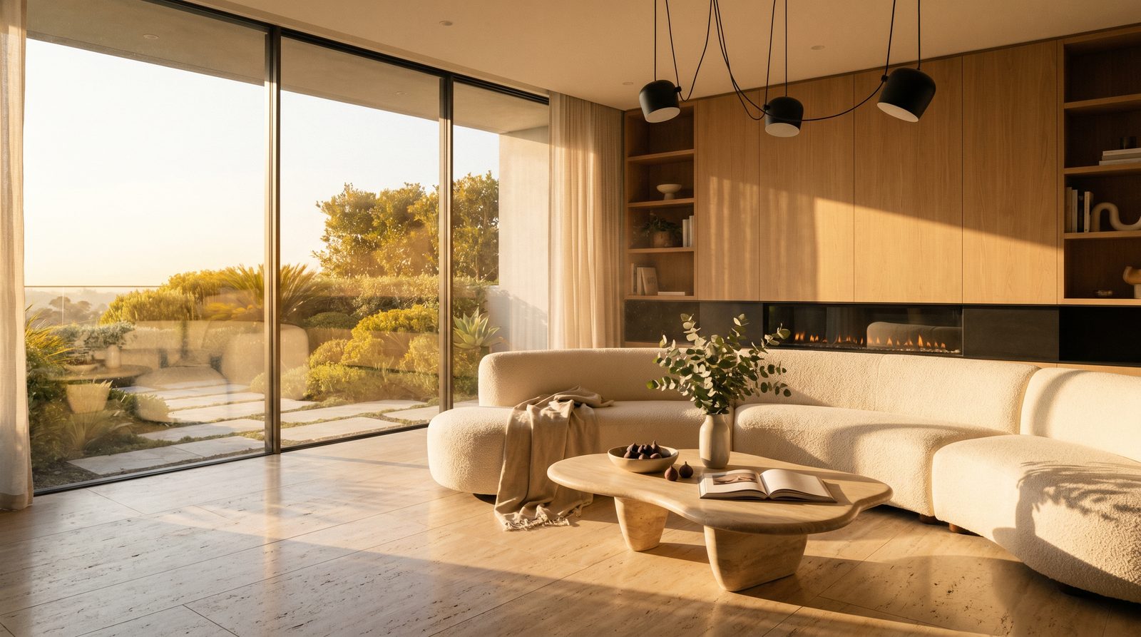
Photorealistic architectural renders are made or broken by materials and textures, not polygon count or render time. The difference between a render that reads as a photograph and one that reads as a model comes down to physically based rendering (PBR) workflows, correctly mapped texture channels, deliberate surface imperfection, and the way materials interact with scene lighting. Get those four things right and photorealism follows.
What Is PBR and Why Does It Determine Realism?
PBR — physically based rendering — is the material system that makes surfaces behave the way real-world physics dictates. Every surface in a PBR workflow is described by a set of texture maps that together tell the renderer how light should bounce, absorb, scatter, and reflect.
In studio work across exterior and interior projects, the shift to a full PBR pipeline is the single biggest quality jump a render can make. A concrete wall that uses only a diffuse (color) texture reads flat and fake. The same wall built with a full PBR stack — albedo, roughness, metallic, normal, ambient occlusion, and displacement — reads as a material with weight and depth.
The core PBR texture channels every material needs
- Albedo (Base Color): The true color of the surface under neutral white light, with no baked-in shadows or highlights. Shadows belong to the lighting engine, not the texture.
- Roughness: Controls how blurry or sharp reflections appear. Polished marble has near-zero roughness; brushed concrete sits around 0.8–0.9. This single map does more for realism than almost anything else.
- Metallic: A binary-ish mask telling the renderer which parts of a surface are conductive (metal) vs. dielectric (everything else). Mixing values in between creates coated or oxidized metal effects.
- Normal Map: Encodes surface micro-geometry — grout lines, wood grain, fabric weave — without adding geometry. A high-quality normal map on a tile floor reads as three-dimensional even at close camera distances.
- Ambient Occlusion (AO): Darkens crevices and contact points where indirect light cannot reach. Baked or real-time AO is what makes objects feel grounded rather than floating.
- Displacement: Actually moves geometry at render time. Used on materials where surface relief is deep enough that a normal map would break down — rough stone, textured stucco, bark. Expensive but irreplaceable for hero surfaces.
- Opacity / Translucency: Required for frosted glass, sheer curtains, perforated screens. Incorrect opacity handling is one of the most common reasons glass reads as plastic.
Glass: The Material That Exposes Every Shortcut
Glass is the most demanding material in architectural visualization, and it is the first thing a developer or architect notices when a render looks wrong. Correct glass requires physically accurate IOR (index of refraction, typically 1.52 for standard float glass), a roughness value that is almost never zero (real glass has micro-scratches), and a scene with enough environmental detail to actually reflect and refract.
In our exterior work on condo towers and glazed commercial facades, we treat glass as a lighting problem as much as a material problem. Glass with nothing to reflect — a grey void sky, an empty scene — will always look fake. The solution is a rich HDRI environment, correctly placed geometry for interior glimpses, and subtle tinting matched to the actual specification in the project documents.
For curtain-wall systems, we also add a slight variation in reflectivity panel-to-panel, mimicking the tolerance differences in real installation. That micro-variation is invisible when described but immediately felt when comparing two renders side by side.
Concrete, Stone, and Masonry: Surface Imperfection Is the Point
No real concrete surface is uniform. It has form-tie holes, bug holes, color variation from pour sequences, edge wear, and weathering. A render that uses a single tiling concrete texture with no variation reads as a digital pattern, not a material.
The techniques that fix this are layered and deliberate:
- Stochastic tiling: Randomizes the UV offset at each tile repetition, eliminating the visible grid that otherwise appears on large surfaces.
- Multi-layer blending: A base concrete texture blended with a grunge/weathering layer at 10–20% opacity adds the color variation that makes large poured surfaces read as real.
- Edge wear masks: Procedural masks that darken or lighten geometry edges simulate the natural wear pattern of corners and reveals.
- Displacement for board-formed concrete: Board-formed concrete has enough surface relief that displacement geometry — not just normal maps — is needed for close-up hero shots.
The same logic applies to stone cladding, brick, and CMU. For exterior rendering work on masonry buildings, we match mortar joint depth and color to the specification sheet, then add a subtle efflorescence layer on lower courses where water contact is realistic.
Wood: Grain Direction, Scale, and Finish Matter Equally
Wood is one of the most frequently mishandled materials in architectural visualization. The three failure modes are: grain running the wrong direction relative to the geometry, texture scale that makes planks look like matchsticks or barn boards, and a roughness value that does not match the specified finish (raw, oiled, lacquered, wire-brushed).
For interior projects — kitchens, feature walls, millwork — we source or produce textures at the actual board width specified, map grain direction to run along the plank length, and set roughness to match the finish schedule. A wire-brushed white oak at 0.65 roughness looks completely different from the same species at 0.2 roughness (lacquered). Both are correct; they just represent different spec decisions.
Anisotropic reflection is also important for woods with a strong directional grain — the highlight should stretch along the grain, not form a circular blob. Most production renderers support anisotropy natively within the material shader.
Metals: Reflectivity, Anisotropy, and Oxidation
Metals in architecture — brushed stainless, blackened steel, anodized aluminum, aged bronze — are each physically distinct and require distinct material setups. The shared failure mode is treating all metals as mirror-like, when most architectural metals are directionally brushed or chemically treated.
- Brushed stainless: High metallic value (0.95+), moderate roughness (0.3–0.45), strong anisotropy aligned to the brush direction. The highlight should be a streak, not a spot.
- Blackened steel: High metallic, high roughness (0.6–0.75), dark albedo. The surface absorbs most light but retains a slight directional sheen.
- Anodized aluminum: Metallic value slightly reduced (0.8–0.85) to simulate the oxide layer, moderate roughness, color from the anodizing process in the albedo channel.
- Aged/patinated bronze: Requires a multi-layer approach — base metal plus a patina layer with a mask that concentrates verdigris in recesses and sheltered areas. This is where a hand-painted mask or procedural cavity map earns its render time.
Fabric, Upholstery, and Soft Furnishings in Interior Renders
Interior renders for hospitality projects and restaurant and retail spaces live or die on soft-material quality. Fabric is a subsurface-scattering problem: fibers are semi-translucent, and light passes through the outermost layer before scattering back. A flat-shaded fabric texture with no SSS contribution looks painted-on.
For upholstery, we use a combination of a high-resolution normal map (capturing individual fiber weave), a sheen layer (available in most modern material shaders as a separate lobe), and a low-intensity subsurface scattering contribution. The sheen lobe is what gives velvet its characteristic glow at grazing angles — without it, velvet reads as matte paint.
Carpet and rugs additionally benefit from displacement or strand-based fiber rendering for close-up shots. At mid-distance, a well-authored normal map is sufficient.
Water, Pools, and Landscape Materials
For landscape and pool rendering, water is the defining material. Pool water has three distinct visual components: surface reflection, refraction through the water body, and the caustic pattern on the pool floor. All three must be present for the water to read as real.
Surface roughness on pool water varies with wind and filtration — a still resort pool at dawn has roughness near 0.02, producing near-mirror reflections of the sky and surrounding architecture. A naturalistic pond or water feature has higher roughness and a subtle normal-animated ripple map.
Landscape materials — lawn, mulch, decomposed granite, pavers — follow the same PBR logic as hardscape materials, with the added complexity of translucency in grass blades and subsurface scattering in foliage. Grass rendered as a flat green plane is the fastest way to make an otherwise strong exterior render look unfinished.
Texture Resolution, UV Mapping, and Tiling Scale
Resolution matters less than mapping quality. A 2K texture mapped correctly at the right real-world scale will always outperform a 4K texture that tiles at the wrong frequency or has visible seams.
The practical rule: set texture scale to match real-world dimensions. A 600×600mm floor tile should occupy exactly that area in UV space. For large surfaces — exterior cladding, poured concrete floors — use triplanar mapping to eliminate seam lines at geometry edges, and combine it with stochastic tiling to prevent repetition artifacts.
For townhouse and residential projects, the materials that get the most scrutiny from buyers and HOA reviewers are roof tiles, siding, and driveway pavers — because those are the materials they can walk up and touch on comparable homes. Getting the scale and texture of those specific materials right is worth the extra iteration.
How Materials Interact With Lighting (and Why You Cannot Separate the Two)
Material settings are not absolute — they are relative to the lighting environment. A roughness value of 0.4 on a surface lit by a single point light reads completely differently from the same value lit by a large-area softbox or an overcast HDRI sky. This is why material calibration always happens inside the final lighting setup, not in isolation.
The practical workflow: establish the camera angle and lighting first, then dial in materials. Adjust roughness in the actual render view, not in a material preview sphere. The preview sphere is useful for gross checks; the final camera view is where photorealism is actually judged.
For pre-sales rendering packages, where multiple views of the same building are needed, we lock material settings globally so that the concrete on the south elevation reads identically to the concrete on the north elevation — even though the lighting on each is different. Consistency across a package is as important as quality in any individual image.
Material Specification Inputs: What to Provide Your Rendering Studio
| Material Type | Ideal Input From Client | What the Studio Needs to Determine |
|---|---|---|
| Exterior cladding (stone, brick, stucco) | Manufacturer name, product code, finish | Real-world scale, grout/joint color, weathering level |
| Glazing systems | Tint color, glass type (low-e, clear, fritted) | IOR, roughness, interior visibility depth |
| Interior flooring | Tile/plank dimensions, species or product name | Layout pattern, grout width, finish (polished/matte) |
| Millwork & cabinetry | Door profile, finish (painted/stained/lacquered), hardware finish | Wood grain direction, sheen level |
| Metal elements | Finish spec (brushed, powder-coated, anodized, patinated) | Anisotropy direction, roughness calibration |
| Soft furnishings | Fabric type, color reference or sample | Weave scale, sheen, SSS intensity |
| Landscape / hardscape | Paver type, lawn species, mulch color | Weathering, moss/stain level, grass density |
The more precise the specification inputs, the fewer revision rounds the project requires. Studios working from vague references — "grey stone, modern look" — have to make assumptions that may not match what the client had in mind.
FAQ
What is the most important material to get right in an architectural render?
Glass is the most consequential single material in most architectural renders. It requires correct IOR, a non-zero roughness value, and a scene rich enough to actually reflect and refract. Poorly handled glass immediately signals to viewers — and to clients — that a render is not production-quality, regardless of how well everything else is executed.
Do I need to provide material specifications to get a photorealistic render?
Specific manufacturer names, product codes, and finish descriptions produce the most accurate results and reduce revision rounds. If specifications are not yet finalized, a good studio can work from representative references — photos, material boards, finish descriptions — and flag assumptions for client confirmation before the final render is delivered.
Why do some architectural renders look plastic even when the geometry is accurate?
The plastic look is almost always a roughness problem. Real surfaces are never perfectly smooth or uniformly rough — they have micro-variation across the surface. Flat, uniform roughness values across large surfaces, combined with missing normal maps and absent imperfection layers, produce the characteristic over-clean appearance that reads as digital rather than physical.
How does texture scale affect photorealism?
Incorrect texture scale is one of the most common and most visible errors in architectural visualization. A floor tile mapped at twice its real-world size makes a room read as a dollhouse; mapped at half size, the same tile makes the space feel cavernous. Setting textures to their actual specified dimensions — and verifying in the rendered view — is a non-negotiable step in production.
Can material quality compensate for poor lighting in an architectural render?
No — materials and lighting are interdependent. The best PBR material stack will look flat and unconvincing under incorrect or low-quality lighting. Photorealism requires both: physically accurate materials calibrated within the final lighting environment. Separating the two in the production workflow is a reliable path to a render that looks almost-but-not-quite real.
If you want to see how material and texture work translates into finished renders for your project type, explore our exterior rendering services and interior rendering services, or contact the studio to discuss your specification package.
Last updated: November 2026